Colors
Color is foundational of design system, providing a consistent and recognizable visual identity that communicates a brand's personality and values. It enhances user experience, builds trust, and fosters loyalty.
Introduction
Colors’ ability to evoke feelings, convey meaning, and establish a strong brand identity helps to create a consistent visual language that users can recognize and associate with our brand. Color follow principles:
Communication is key
Our primary focus is on clear communication, supporting the purpose of the content. By thoughtfully utilizing colors, we ensure that the chosen color scheme effectively demonstrates the hierarchy of information, conveys interactive states, and distinguishes between different elements.
Color has meaning
Colors have roles, each of which has a specific meaning. Define the role of each color to make things easy to modify and expandable. Consider avoiding the use of meaningless colors within the interface.
Accessibility
We adhere to the WCAG AA standard for contrast ratios, ensuring that our user interface meets the following criteria:
Must pass a 3:1 contrast ratio: This applies to any essential UI element that is crucial for users to understand the overall experience. It also includes text that is 24px or larger, in accordance with WCAG 1.4.11.
Must pass a 4.5:1 contrast ratio: This pertains to text that is smaller than 24px, as outlined in WCAG 1.4.3. We ensure that the contrast between the text and its background meets or exceeds this ratio, enabling improved readability and accessibility for all users.
Color role
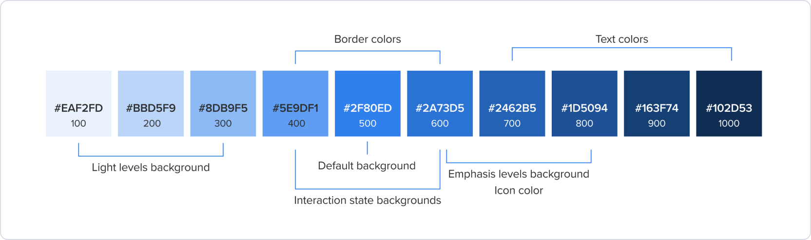
Primary palette
Focus only in Primary color and primary variant color roles and illustration should be real component which has specific case like this example. Please do not include the secondary into primary color roles. According to the Color roles: we will have : Sencondary, Color Variants Link to references: https://polaris.shopify.com/design/colors
Primary colors serves as the primary action and elements for key interactions, such as indicating operation status or highlighting important information.
Secondary palette
Secondary colors can reinforce brand identity and should be used to complement and support primary colors. In user interfaces, they can be used for navigation elements.
Color variants
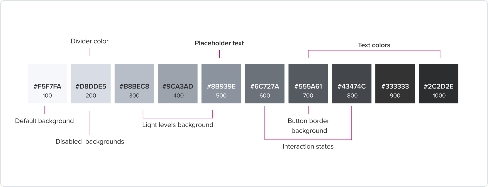
Neutral palette
The Neutral can work alongside any color. They apply to most backgrounds, text, and shapes in the user interface. To ensure the accessibility of the user (target contrast ratio), the neutral elements should have a higher level than other colors. For example, the neutral button background should use neutral 700.
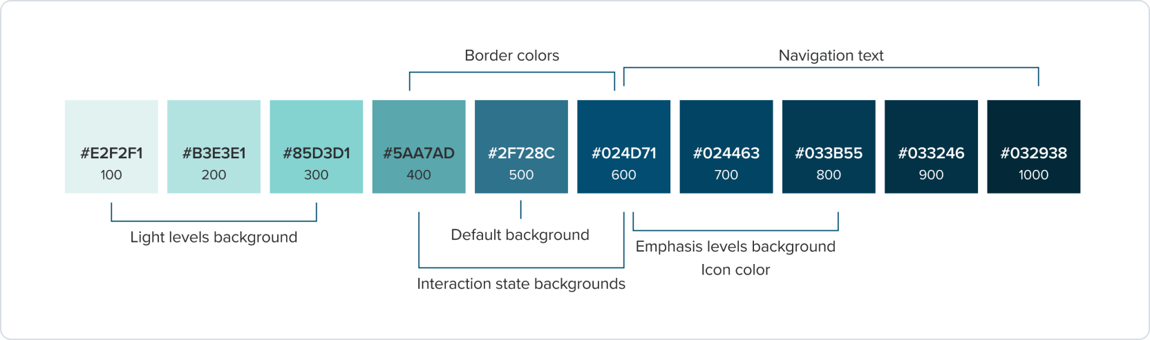
Blue palette
The blue palette can be used to indicate different types of information or sections within the design system, or communicates something is in progress.
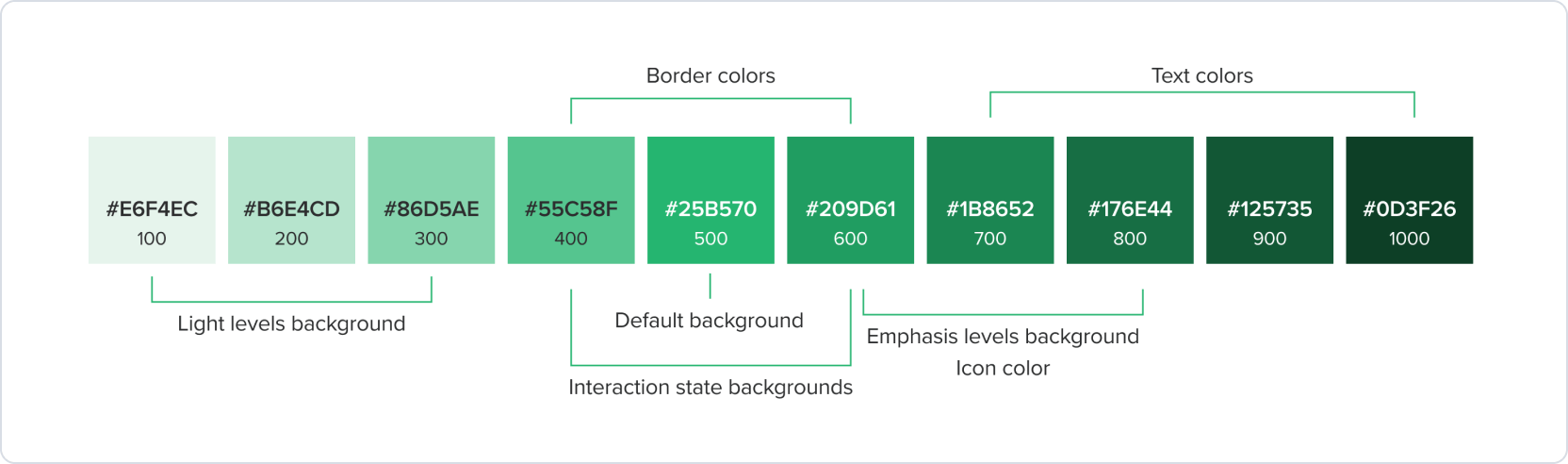
Green palette
Green palette is commonly used to indicate positive actions, such as success, confirmation, or completion. It can also be used to represent safety or permission, such as in a “Go ahead” or “Safe to proceed” context. Additionally, green can be used to indicate health or environmental friendliness in certain contexts.
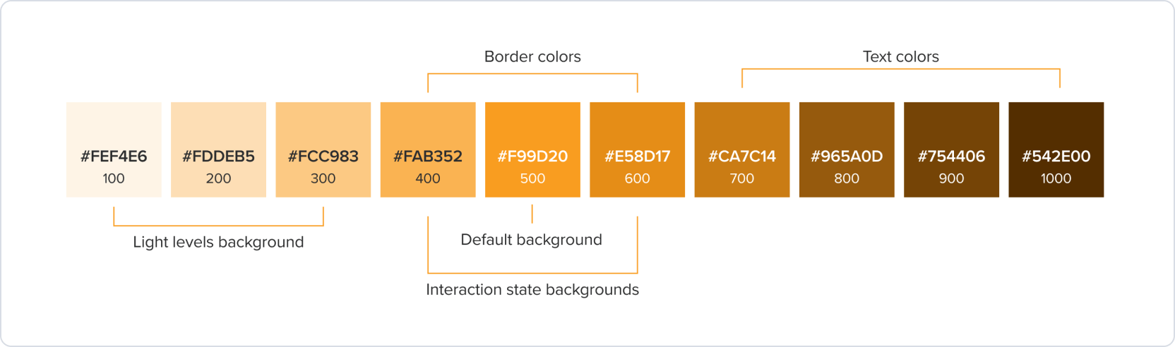
Orange palette
Orange/yellow can be used as an accent color in a design system to bring attention to specific elements or actions, such as notifications, or warnings.
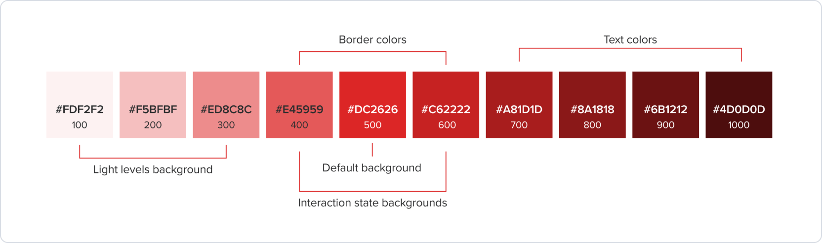
Red palette
In a design system, red can be used to draw attention and communicate warnings or errors. For example, it can be used for error messages, alerts, or to indicate when an action will have irreversible consequences.
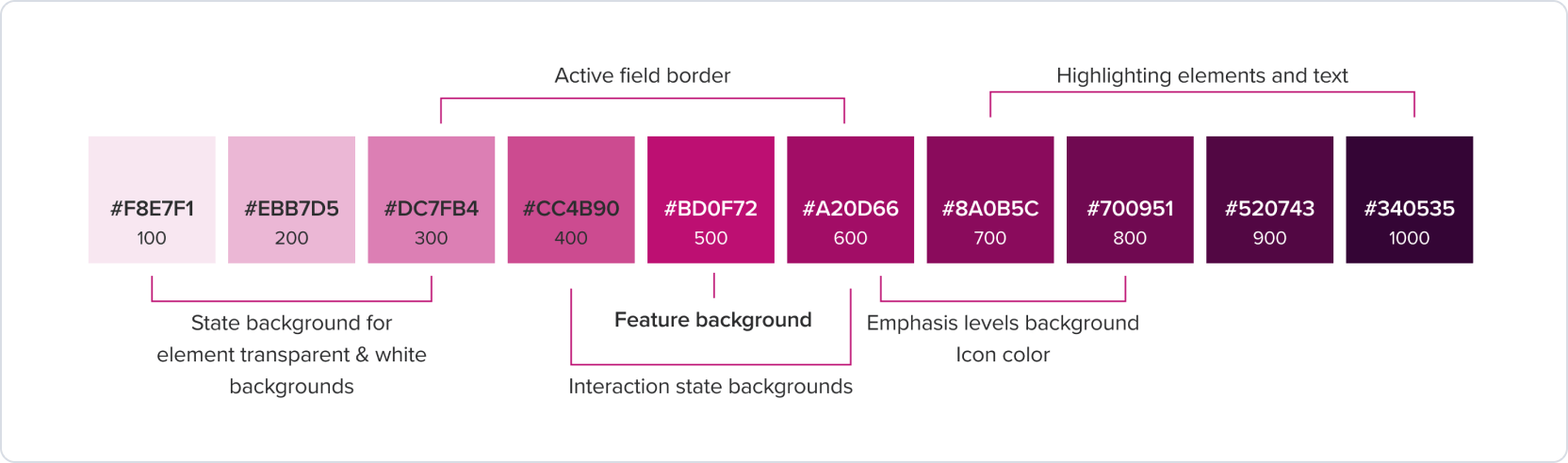
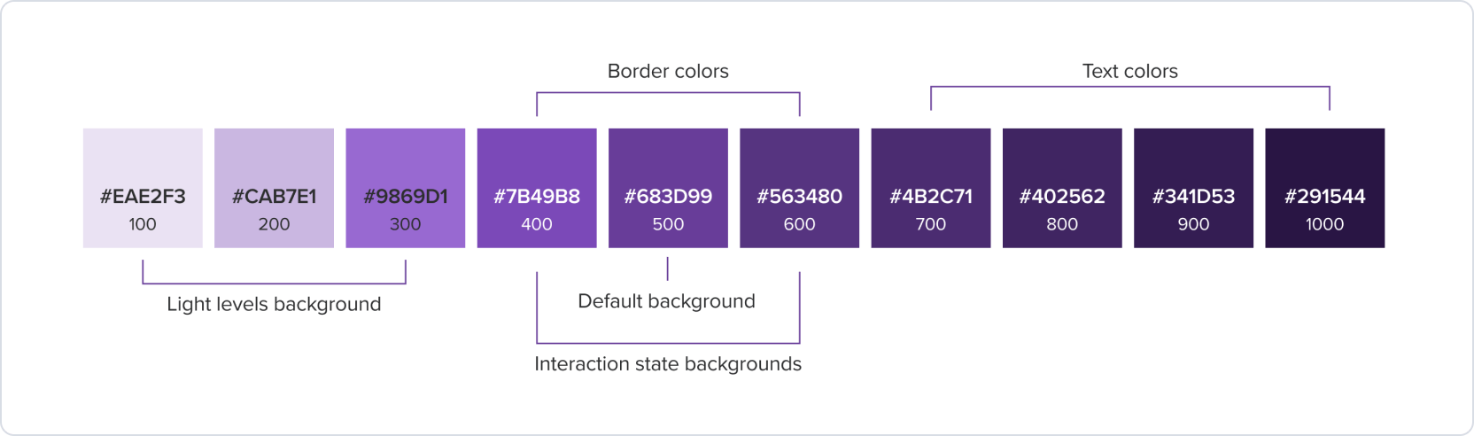
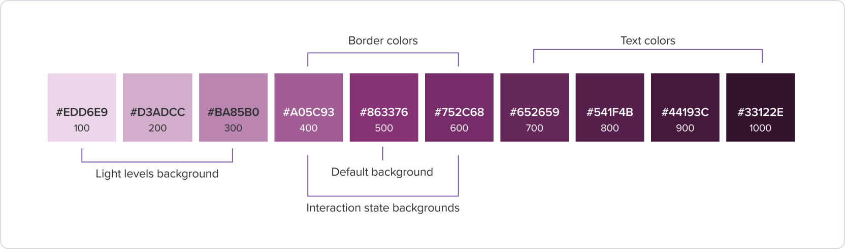
Purple palette
Purple palette are used for charts and graphs, helping to communicate complex data in a visually appealing way. Purple (#683D99) is used for charts and graphs, helping to communicate complex data in a visually appealing way.
Royal purple palette
Royal purple is a supporting color in the secondary palette of the brand identity. It is used for decoration, illustrations, and data visualization.
Example
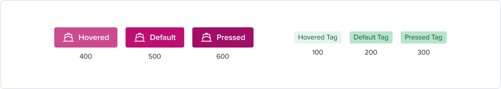
Interaction states
Different visual states of a UI component that indicate the user’s interaction with it.
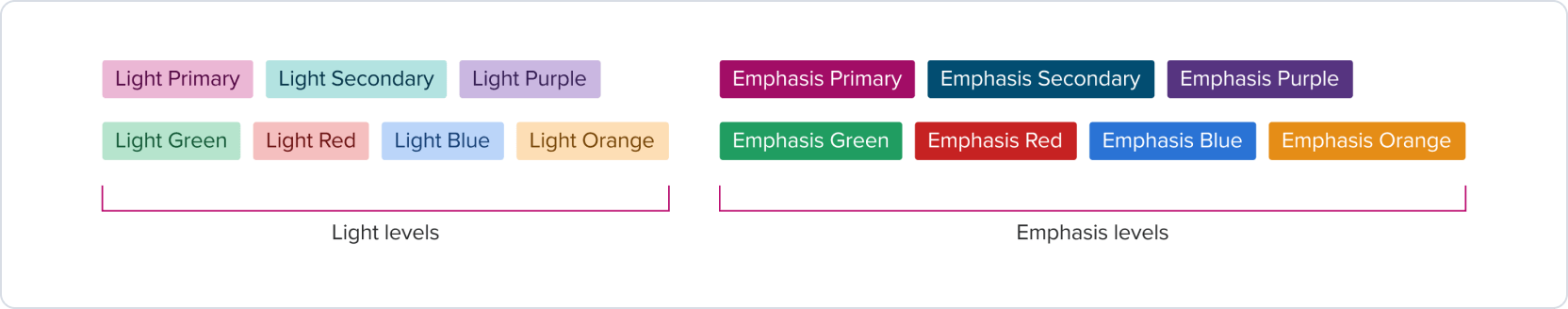
Light and Emphasis level
Light level contrast refers to the subtle contrast that a color has against the default surface. It is particularly useful in busy interfaces where there is a lot of visual information. Emphasis levels with bolder colors exhibit higher contrast, making them more attention-grabbing compared to subtle colors.
Was this page helpful?
Palette
Colors
Theme Color
Brand Color