Border Radius
Border radius refers to the property that defines the rounded corners of a shape or container within a user interface.
Introduction
Border radius, also known as shape/container rounded corners, is a design property that determines the degree of curvature applied to the corners of a shape or container within a user interface. Our design system defines the default border radius values and their usage across various component sizes, including small, medium, large, extra-large, and full/circle.
Border radius values
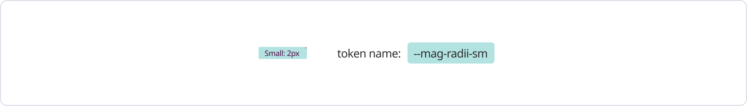
Small
The slight border radius of 2px is employed for smaller elements within our design system. It is well-suited for elements with a height of 16px or less that necessitate minimal rounding of corners.
Medium
The default border radius of 4px serves as the standard for medium-sized components within our design system. It is primarily used for buttons, input fields, and other UI elements that require a balanced level of rounding.
.b24dffa4.png)
Large
The large border radius of 8px is specifically used for larger components within our design system. It is suitable for containers, cards, dropdown menus, and other elements where a more pronounced rounding is desired.
.0c9aa863.png)
x-Large
The extra-large border radius of 12px is reserved for the largest components within our design system. It is primarily used for prominent elements like modals, dialogs, or full-width banners to create a visually striking appearance.
.9ee7335f.png)
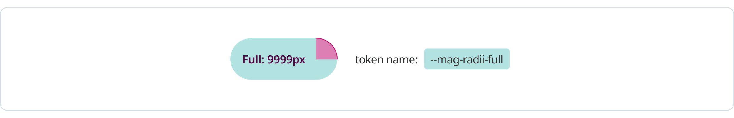
Full/ Circle
The full/circle border radius is specifically used when a perfect circular shape is desired. It is often employed for avatars, profile pictures, or any other UI components that require a circular form.
In use
Maintaining consistent border radius values throughout our design system is crucial for visual harmony and a cohesive user experience. Components with similar purposes or hierarchical relationships should use the same border radius values.
Border weight
Border weight typically refers to the thickness or width of a border applied to a UI element. It defines the visual prominence and visibility of the border.
Light
The standard border weight is 1px.
.080f8a1d.png)
Bold
For elements that require emphasis or visual distinction, a bolder border weight of 2px can be used.
.b476b3c8.png)
Was this page helpful?
Border Radius
Rounded
Corner