Elevation & Shadow
Elevation refers to the relative depth or distance between two surfaces along the z-axis, while shadow is the darkened area that appears on a surface as a result of an object blocking light. When used together, elevation and shadow create a sense of depth and hierarchy in a user interface.
Introduction
The elevation of an element indicates the distance between surfaces and the depth of its shadow. When an element has a higher elevation, it casts a deeper shadow, which creates a sense of depth and hierarchy. In contrast, a lower elevation results in a shallower shadow and a flatter appearance.
Elevation Levels
In our design system, we have defined three levels of elevation: Low, Medium, and High Layer. Each level represents the relative importance or prominence of the UI element. These elevations vary by the spread of their drop shadow.
Low level
The default level/layers on default page background color. It represents default UI, including the clickable cards.
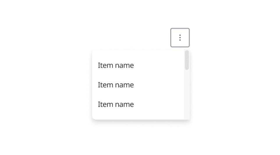
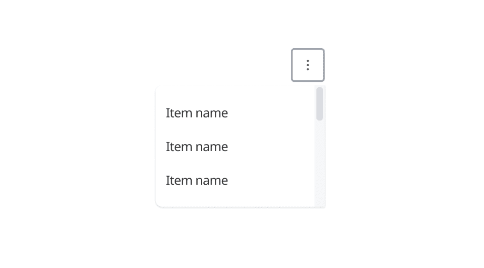
Medium level
Slightly higher than the default level/layers, reserved for raised cards, dropdown menus, and sidebar menus. Can also be used for cards to provide additional hierarchy or emphasis.
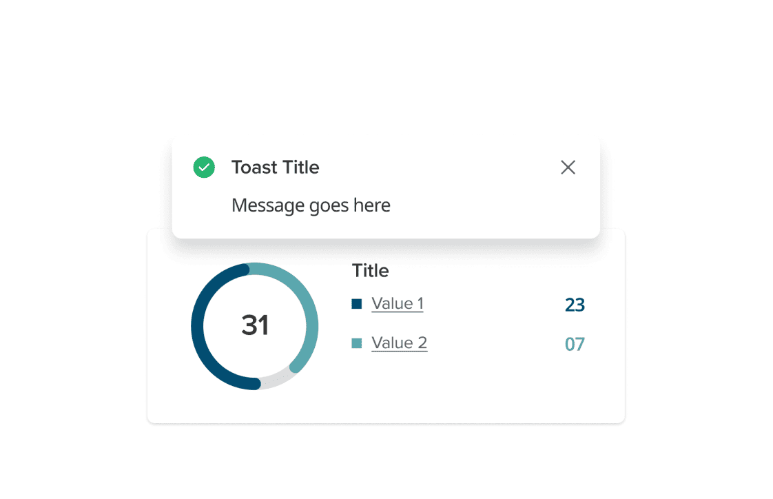
High level
High level for UI elements that sit over another UI, such as modals, dialogs, floating toolbars, and floating single-action buttons.
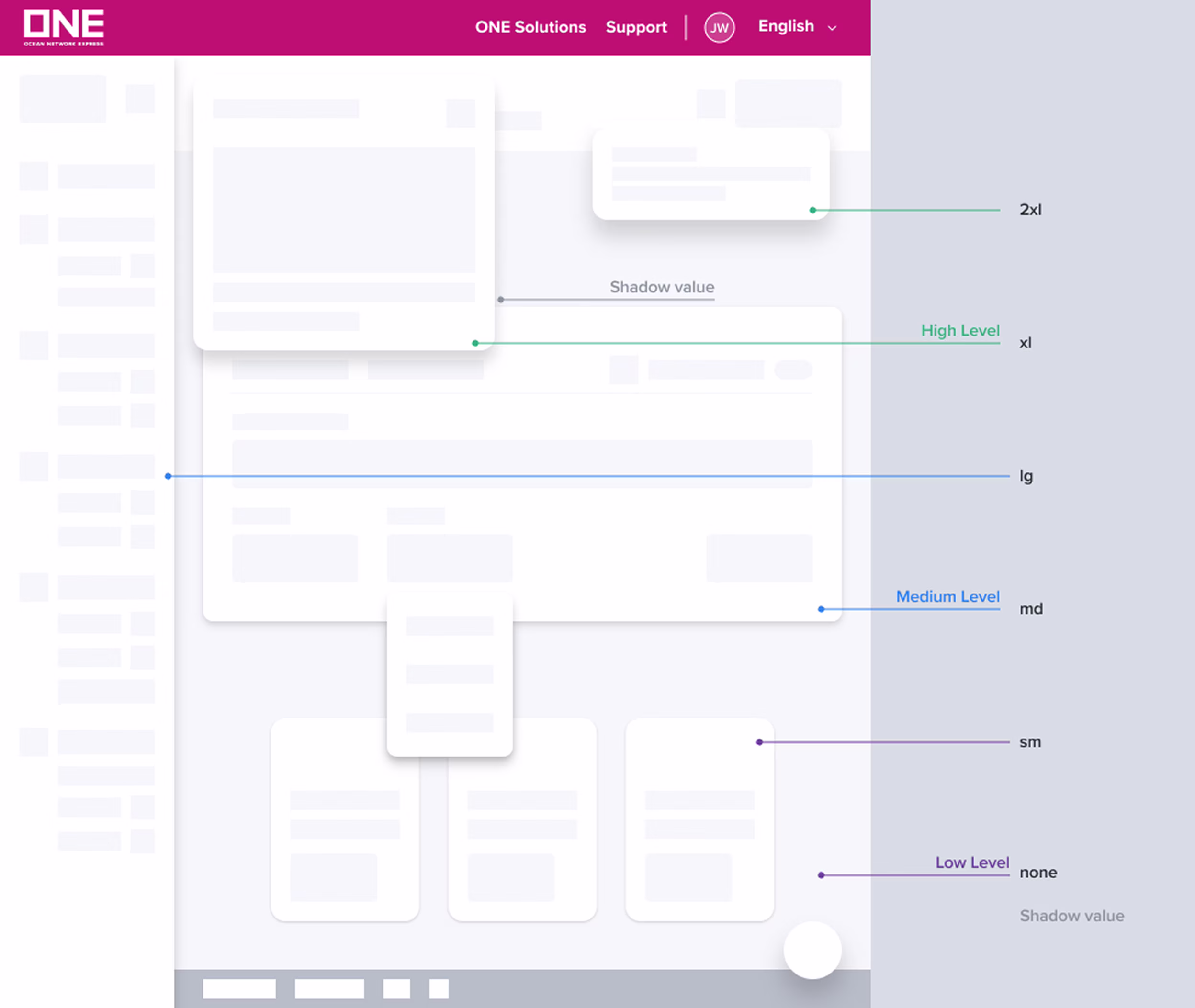
Shadow values and usage
Our design system has 6 shadow values will vary between 3 different elevations. And Inner value is a shadow indicating content has scrolled outside a view. It can be used for vertical or horizontal scroll.
Level | Name | Value | Usage | Example |
|---|---|---|---|---|
Low | none | core drop shadow: x: 0 - y: 0 - Blur: 0 - Spread: 0 cast drop shadow: x: 0 - y: 0 - Blur: 0 - Spread: 0 | Flat UI surface | |
sm | core drop shadow: x: 0 - y: 1 - Blur: 2 - Spread: 1 cast drop shadow: x: 0 - y: 1 - Blur: 2 - Spread: 0 | Clickable Cards Flat card raised Default form container | ||
Medium | md | core drop shadow: x: 0 - y: 2 - Blur: 4 - Spread: 2 cast drop shadow: x: 0 - y: 2 - Blur: 6 - Spread: 0 | Card raised (pickup/hover, move) Form container | |
lg | core drop shadow: x: 0 - y: 4 - Blur: 8 - Spread: 3 cast drop shadow: x: 0 - y: 2 - Blur: 8 - Spread: 0 | Dropdown menu Selection menu Picker Major form (emphasis e.g: login, booking,…) Drag cards | ||
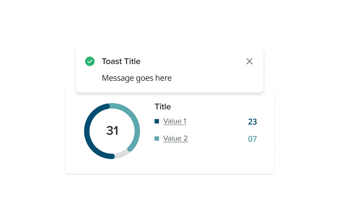
High | xl | core drop shadow: x: 0 - y: 8 - Blur: 10 - Spread: 4 cast drop shadow: x: 0 - y: 0 - Blur: 10 - Spread: 0 | Modal Toast FAB resting | |
2xl | core drop shadow: x: 0 - y: 10 - Blur: 16 - Spread: 6 cast drop shadow: x: 0 - y: 0 - Blur: 12 - Spread: 0 | Tooltip, Popover FAB raised | ||
Inner | inner | core inner shadow: x: 0 - y: 0 - Blur: 2 - Spread: 1 cast inner shadow: x: 0 - y: 0 - Blur: 6 - Spread: 0 | Scrolled box |
Elevation in use (Do and Don’t)
Do
Use correct shadow value for element on each elevation level
Don't
Use shadow value that not align with usage document
Do
Active elements should have high elevation shadows
Don't
Apply low elevation shadows for active elements may cause missing attention

Do
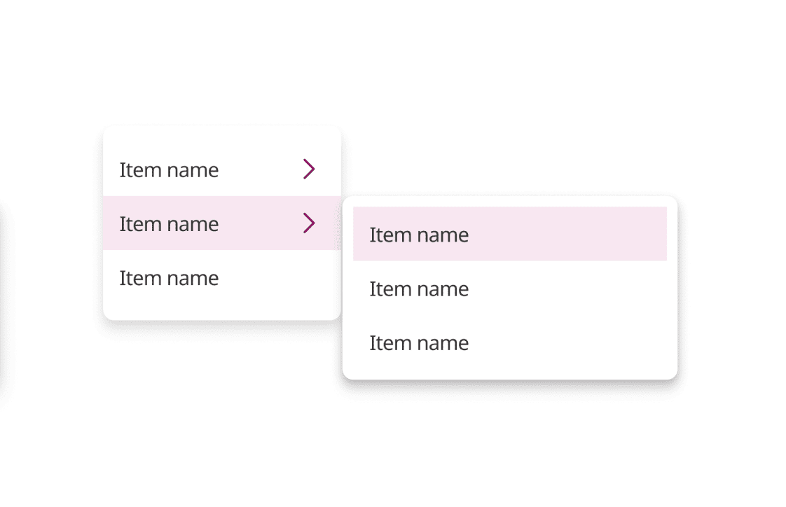
Use higher elevation for the child menu
Don't
Use the same level may cause confuse
Was this page helpful?
Shadow
Depth