Typography
Typography is a set of system fonts and recommendations that govern the use of typography in a design project based on brand identity.
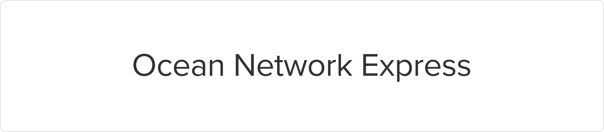
ONE Typeface
We use different fonts for different languages to maintain a consistent tone of voice. Comparable font families have been used to create similar hierarchy structures in both languages.
Brand fonts - Proxima Nova
Reserved for the ONE logo system and all external sub-brand logos to maintain visual consistency across brand marks. Proxima Nova is reserved for the ONE logo system, all sub-brand logos, taglines, and slogans. It’s a bold, modern typeface that gives our marks their distinctive presence. It is typically used in bold weight with slightly tighter tracking to create a strong, compact look. It should only appear in official logos—never in general body copy or other text applications. Only authenticated users can download our brand fonts.
Product fonts - Noto Sans
In a similar way to our branding font - Proxima Nova, Noto Sans comes in a variety of weights that are comparable to Proxima Nova: Black, Bold, Medium, Regular and Light. By contrasting thick and thin cuts we can offer dynamic contrast as well as establish hierarchy, which helps to communicate key information.
Access to the full Noto Sans family can be found on Google Fonts.

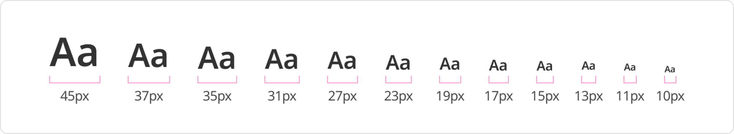
Font size - Scale
Font sizes directly impact the legibility and visual hierarchy of our product. We have defined a range of font sizes based on the major third type scale, with a ratio of 1.2, to determine the font sizes in this system. Each font size is calculated by multiplying or dividing the previous size by 1.2, starting with the base size, and then rounding the result to the nearest multiple of 4 pixels.
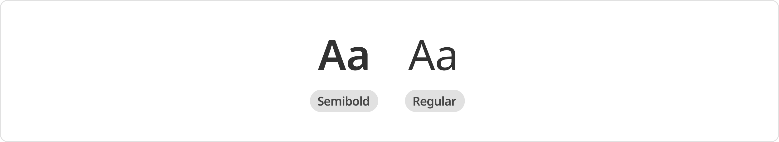
Font weights
Font weight can play a crucial role in creating visual hierarchy and emphasizing specific elements in a design. However, it is important to ensure that the weight selected is appropriate for the text size and context in which it will be used:
- Regular weight is for generic paragraphs to contrast with headings.
- Semibold weight is for special situations where text needs clearer distinction or stronger emphasis, and apply it only when necessary.
In addition, it is vital to ensure that the text has adequate contrast with the background, and the weight selected is consistent with the overall branding of the design project or brand identity.
Font styles
Font styles serve distinct roles in effectively communicating information and establishing a clear visual hierarchy. We have defined a consistent typographic hierarchy for headings, subtitles, and various body text elements within our product. By utilizing appropriate font styles that align with their designated roles, we create visual clarity, enhance readability, and guide users through the interface seamlessly.
Heading
Heading styles are essential for establishing a clear structure and hierarchy on a page by introducing and segmenting content. They command attention through larger size, bolder weight, and greater visual prominence. Headings should be used sparingly within a single page.
Preview | Usage | Size | Viewport | Font weight | Font size | Line height |
|---|---|---|---|---|---|---|
H1 |
| lg | 1920 & above | 600 | 45 | 52/3.25 |
md | 1280 - 1919 | 600 | 37 | 44/2.75 | ||
sm | Under 1280 | 600 | 35 | 40/2.5 | ||
H2 | Empty states and feature introductions. Top level headers. | lg | 1920 & above | 600 | 37 | 44/2.75 |
md | 1280 - 1919 | 600 | 31 | 36/2.25 | ||
sm | Under 1280 | 600 | 27 | 32/2 | ||
H3 |
| lg | 1920 & above | 600 | 31 | 36/2.25 |
md | 1280 - 1919 | 600 | 23 | 28/1.75 | ||
sm | Under 1280 | 600 | 19 | 24/1.5 | ||
H4 | Main titles, use only once per product page | lg | 1920 & above | 600 | 23 | 28/1.75 |
md | 1280 - 1919 | 600 | 19 | 24/1.5 | ||
sm | Under 1280 | 600 | 17 | 22/1.375 | ||
H5 | Headings of key functionality | lg | 1920 & above | 600 | 19 | 24/1.5 |
md | 1280 - 1919 | 600 | 17 | 22/1.375 | ||
sm | Under 1280 | 600 | 15 | 20/1.25 | ||
H6 | Headings of key functionality | lg | 1920 & above | 600 | 17 | 22/1.375 |
md | 1280 - 1919 | 600 | 15 | 20/1.25 | ||
sm | Under 1280 | 600 | 13 | -0.2 |
Body
Body typography refers to the primary textual content of a design, including paragraphs, sentences, and other information that conveys the main message or details.
Preview | Usage | Size | Viewport | Font weight | Font size | Line height |
|---|---|---|---|---|---|---|
body 1 - regular |
| lg | 1920 & above | 400 | 15 | 24/1.5 |
md | 1280 - 1919 | 400 | 13 | 20/1.25 | ||
sm | Under 1280 | 400 | 11 | 16/1 | ||
body 1 - semibold |
| lg | 1920 & above | 600 | 15 | 24/1.5 |
md | 1280 - 1919 | 600 | 13 | 20/1.25 | ||
sm | Under 1280 | 600 | 11 | 16/1 |
Detail
Detail typography refers to smaller text elements that provide additional context or supplementary information within the design. This component includes captions, labels, footnotes, citations, or other text supporting and enhancing the main content.
Preview | Usage | Size | Viewport | Font weight | Font size | Line height |
|---|---|---|---|---|---|---|
body 2 - regular | Default helper text | lg | 1920 & above | 400 | 13 | 20/1.25 |
md | 1280 - 1919 | 400 | 11 | 16/1 | ||
sm | Under 1280 | 400 | 10 | 12/0.75 | ||
body 2 - semibold | Default label | lg | 1920 & above | 600 | 13 | 20/1.25 |
md | 1280 - 1919 | 600 | 11 | 16/1 | ||
sm | Under 1280 | 600 | 10 | 12/0.75 | ||
body 3 - regular | Default caption accompanies an image, illustration, or media element to provide a descriptive or explanatory context. | lg | 1920 & above | 400 | 11 | 16/1 |
md | 1280 - 1919 | 400 | 11 | 16/1 | ||
sm | Under 1280 | 400 | 10 | 12/0.75 | ||
body 3 - semibold | Default caption accompanies an image, illustration, or media element to provide a descriptive or explanatory context. | lg | 1920 & above | 600 | 11 | 16/1 |
md | 1280 - 1919 | 600 | 11 | 16/1 | ||
sm | Under 1280 | 600 | 10 | 12/0.75 | ||
body 4 - regular | Small caption | lg | 1920 & above | 400 | 10 | 12/0.75 |
md | 1280 - 1919 | 400 | 10 | 12/0.75 | ||
sm | Under 1280 | 400 | 10 | 12/0.75 | ||
body 4 - semibold | Small caption | lg | 1920 & above | 600 | 10 | 12/0.75 |
md | 1280 - 1919 | 600 | 10 | 12/0.75 | ||
sm | Under 1280 | 600 | 10 | 12/0.75 |
Button
Preview | Usage | Size | Viewport | Font weight | Font size | Line height |
|---|---|---|---|---|---|---|
Use only for button | lg | 1920 & above | 600 | 15 | 24/1.5 | |
md | 1280 - 1919 | 600 | 13 | 20/1.25 | ||
sm | Under 1280 | 600 | 11 | 16/1 |
Accessibility
Key factors to follow for an accessible typography:
- Color: Use approved text color tokens to meet minimum contrast requirements and ensure readability.
- Responsive: Use responsive typography and relative units (such as rem) so text adapts properly across different device and browser settings.
- Consistency: Apply standardized text styles in Figma and use typography tokens and components in code to maintain consistent font families, sizes, and hierarchy across the interface.
- Hierarchy: Follow the correct heading structure. Use proper heading styles and tokens in both design and development to build a clear content hierarchy. Headings should organize related information and support efficient navigation and scanning.
- Structure HTML tags properly so assistive technologies can correctly interpret and announce content.
- Follow established interaction patterns that rely on text to ensure consistency and usability.
Was this page helpful?
Font
Fonts
Text
Type
Heading
Body Text