Icons
Icons are visually compact and simplified graphic element that represents a specific object, action, or concept.
Introduction
Icons play a crucial role in design systems enhance usability, improve visual communication, and maintain a cohesive visual language across various user interfaces. They capture attention, convey messages quickly, and are easy to remember. The icons follow 2 principles:
- Simplicity and Easy Comprehension—Icons should be simple and easy to understand at a glance, conveying their intended meaning clearly and intuitively.
- Consistency—Ensure consistency in the visual style and weight of the icons. All icons should share a common visual language to establish a cohesive design system.
Guideline
Base grid
The base grid for icons is 32px x 32px, providing a foundational guideline for positioning and scaling. Icons are created at this size and scaled down linearly for different uses. Designers can align artwork to the grid and make necessary adjustments for achieving desired shapes.
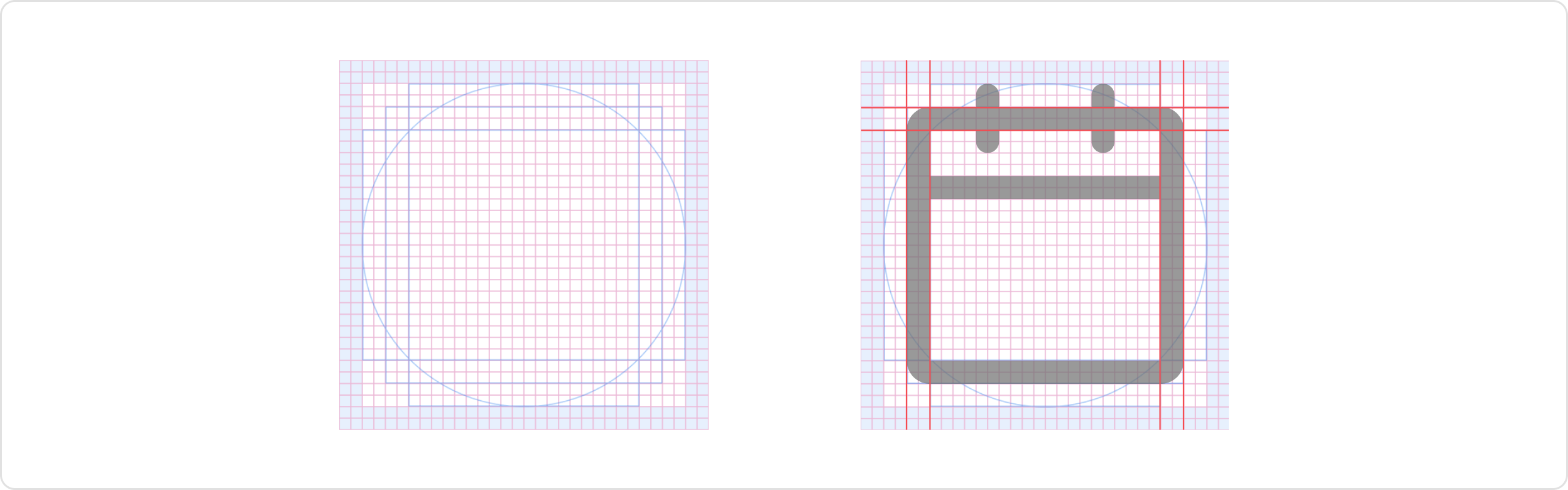
Padding
The 2px padding within the grid preserves the desired scale and white space around icons when exported. It allows for consistent spacing and alignment in the design system. If needed, artwork can extend into the padding to add visual weight or include specific details for the icon’s content and meaning.
Key lines
These key lines serve as the starting point for creating icons and help establish a consistent visual language across the icon set. Designers can modify and build upon these shapes to create icons that effectively represent various elements and concepts while maintaining visual consistency throughout the design system.
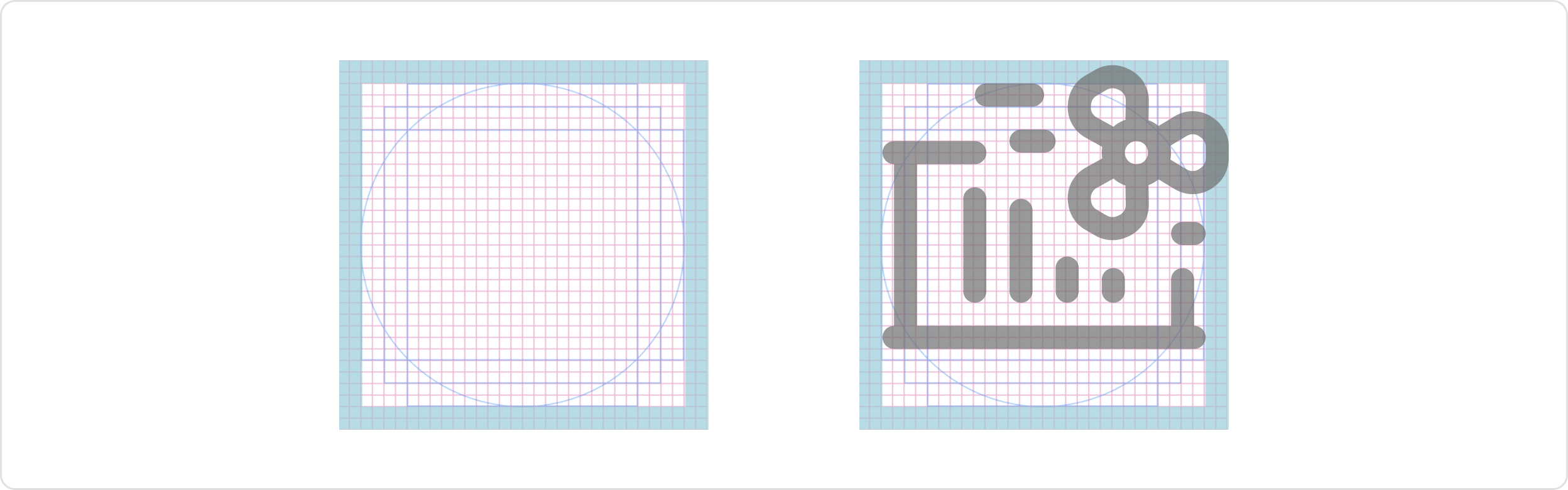
Stroke weight
We maintain a consistent 2px stroke weight for icons to ensure scalability across various backgrounds and screen resolutions. This ensures that no icon appears heavier or lighter than others of the same size. Similarly, within a single icon, different stroke weights should be avoided.

Corners
Icons should have a consistent corner radius of 2 pixels. However, the corner radius can be increased in multiples of two when needed to enhance the icon’s metaphor or to clearly define the shape of an object. Additionally, the start and end points of the icon should be rounded.
Naming conventions
Choose icon names based on the real objects they represent or accurately describe the icon’s purpose or function in a clear and intuitive manner.
Follow this structure: name_variants-style
Draw tips
- Use rounded corners on all corners of an icon. This will create a more balanced and symmetrical look.
- Avoid using rounded corners on icons that are meant to represent sharp objects, such as knives or needles.
- Use rounded corners on icons that are meant to represent soft objects, such as clouds or flowers.
- Always keep a simple, flat style.
Usage
Sizing
The sizing of icon follows a scale relative to the font size and line height. The recommended pairings are as follows:
- The icon size of 20 pairs with font sizes of 16px and 14px.
- The icon size is 16px for a small font size of 12px.
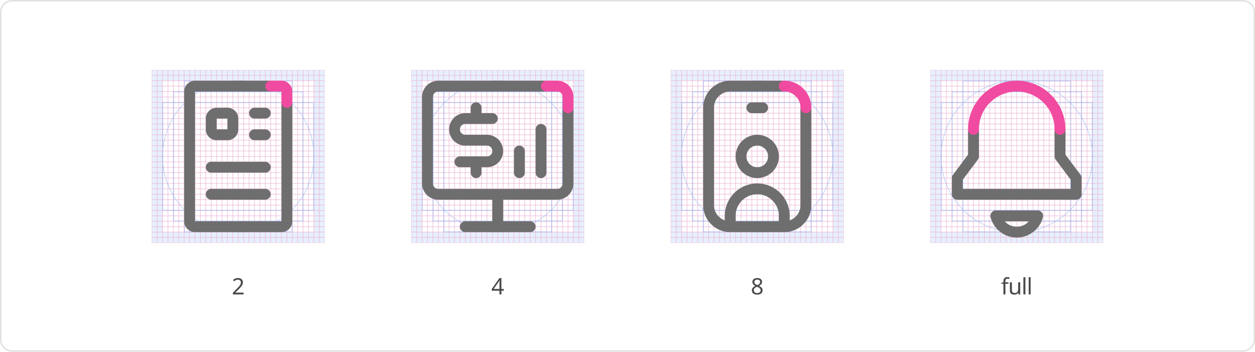
Additionally, size 24 and 32px can be used for emphasis or when a larger, more prominent icon is necessary to draw attention. In situations where the font size is tiny, such as 10px, the use of a tiny icon size of 12px can be considered. This ensures that the icon remains proportional to the smaller text and fits within confined spaces.

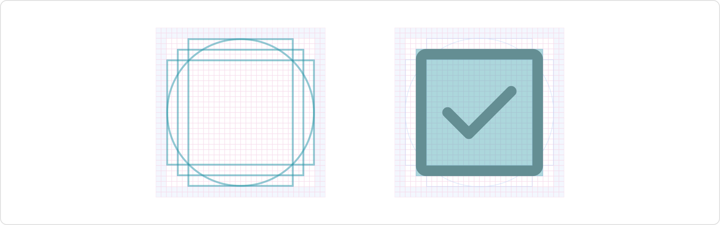
Styles
We have three styles that provide visual variety and hierarchy, allowing designers to effectively communicate different levels of importance or actions. These are outline (default style), fill and two tone
- Outline: The default style for icons is outlined, where the icon’s shape is represented by a 2px stroke.
- Fill: or solid style, is used to emphasize icons by enhancing visibility and drawing attention to key actions or important elements.
- Duo-Tone: The two-tone style adds an extra layer of emphasis to icons. It combines two colors, typically a primary and secondary color, to create contrast and visual interest.

Colors
The default color icon is neutral 700, and neutral 400 for disabled state. For icons contained by components, follow the guidelines associated with the component and use case.
Ensure that icons have sufficient contrast with their background or surrounding elements for readability and accessibility, meeting the same color contrast ratio as typography (4.5:1). Select colors that align with the intended meaning or function of the icon and consider matching your icon color with your text color when pairing them. Incorporate brand colors or colors that are consistent with the overall brand identity.
For more information on color, please see the Colors guide.
Was this page helpful?
Icons
Icon Set
Glyph