Spacing
Spacing refers to the negative space or distance between design elements within a design system. It provides visual separation, establishes hierarchy, and elevates the user experience.
Introduction
Proper spacing is an essential aspect of any design system. It helps to create a balanced and harmonious design, establishes a clear hierarchy of information, and provides visual breathing room. The spacing follows principles:
Consistency
Unified spacing ensures a cohesive visual experience, aiding navigation and comprehension.
Hierarchy
Varying spacing establishes visual importance, guiding users through a clear and organized interface.
Clarity
Well-controlled spacing enhances legibility, prevents overcrowding, and promotes focus.
Spacing base unit
Our design system utilizes a base unit of 4 pixels to establish a consistent scale for spacing.
Spacing scale
We achieve consistent and proportional spacing by utilizing a set of spacing value from 0 to 80 px, that is defined by using multiples of 2 and 4. Each value has own token based on its pixel value.
Pixel | Rem | Base unit | Usage |
|---|---|---|---|
0 | 0 | 0 | Use for small and medium elements of UI:
|
2 | - | 0.5x | |
4 | - | 1x | |
6 | - | 1.5x | |
8 | 0.5 | 2x | |
10 | 0.625 | 2.5x | |
12 | 0.75 | 3x |
|
16 | 1 | 4x | |
20 | 1.25 | 5x | |
24 | 1.5 | 6x | |
32 | 2 | 8x |
|
40 | 2.5 | 10x | |
48 | 3 | 12x | |
64 | 4 | 16x | |
80 | 5 | 20x |
Spacing in use (Do and Don’t)
Building connections
The amount of space between items creates relationships. When items are positioned closely together, they are perceived as more connected and related. As more space is added between elements, their perceived relationship weakens, and they are seen as less connected.
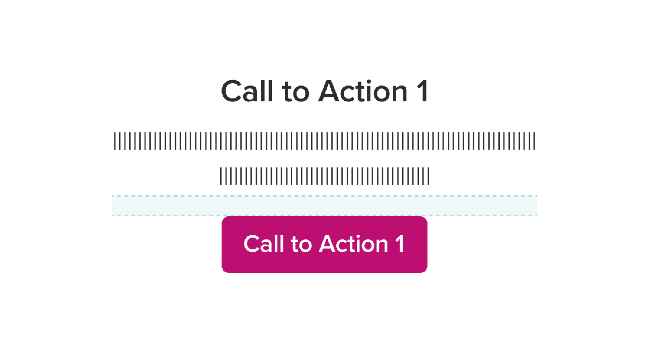
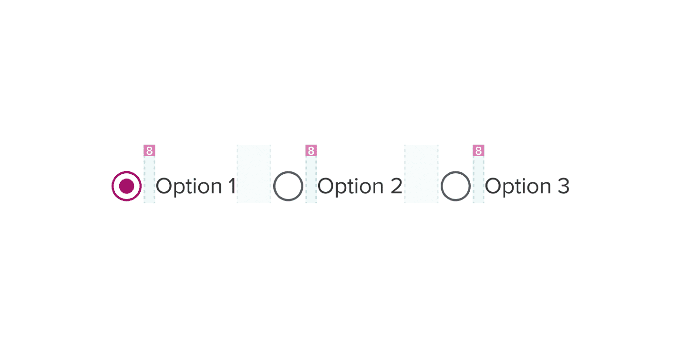
Do
Use appropriate spacing to connect the elements that are related
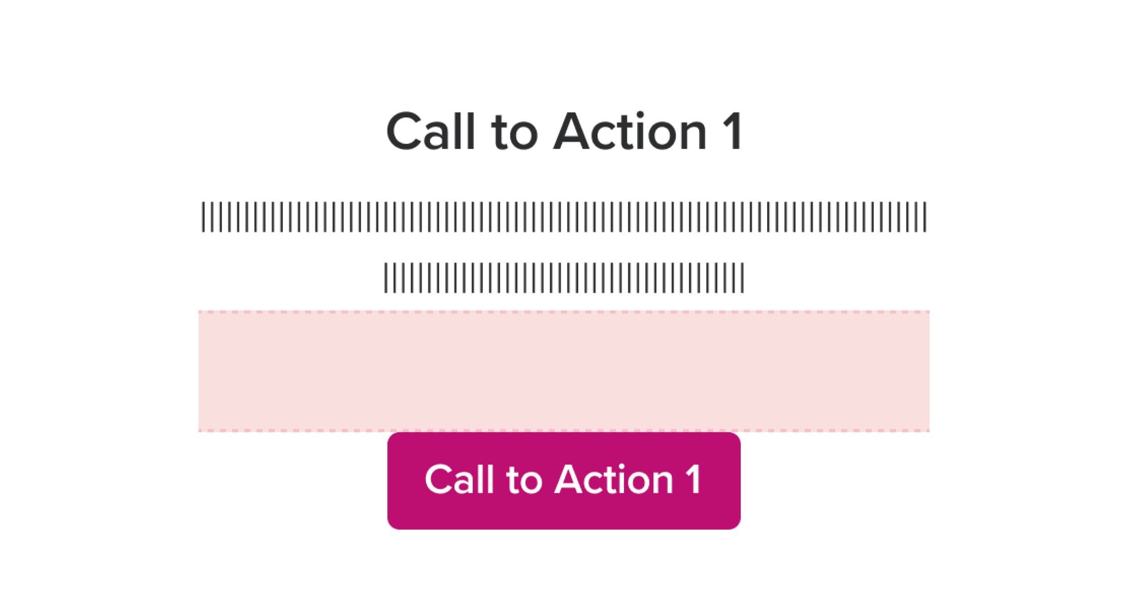
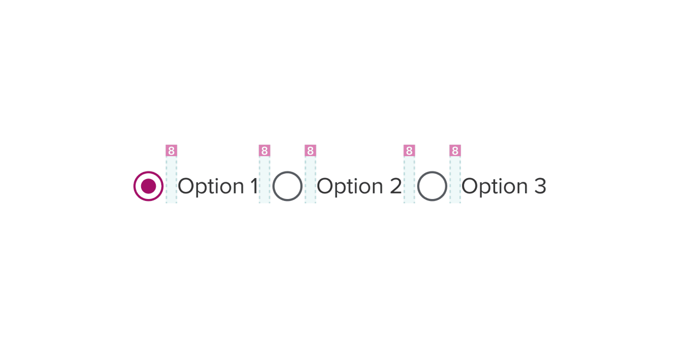
Don't
Too long spacing may cause incoherence
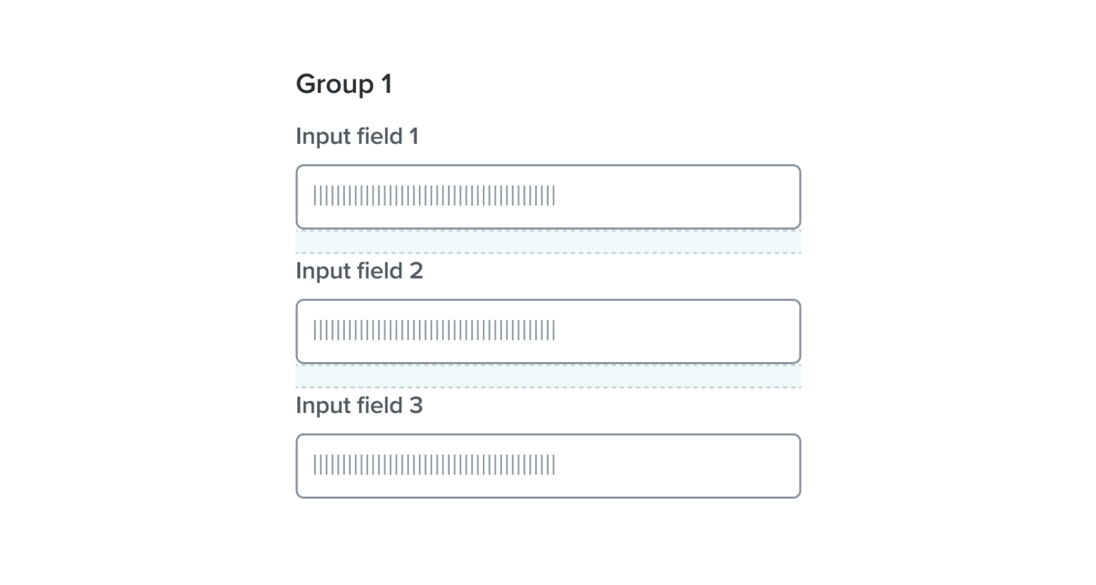
Do
Ensure consistent spacing across elements in the same group
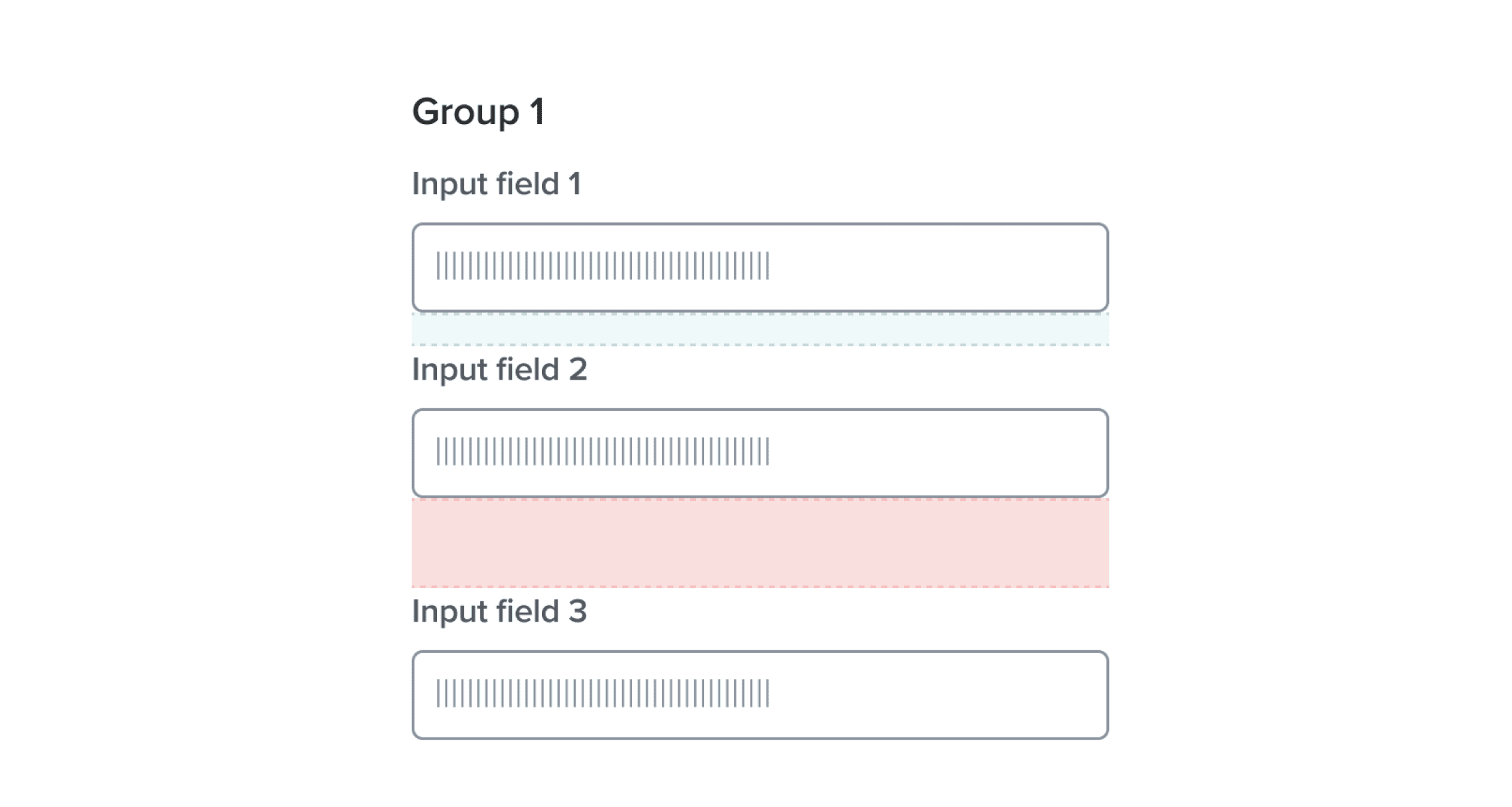
Don't
Inconsistent spacing impacts how users group information during scanning
Do
Make sure element groups are clearly separated
Don't
Too little spacing makes groups visually indistinguishable
Hierarchy
Just like the sizing of elements, spacing also contributes to the perceived importance of elements. To use spacing effectively for hierarchy, elements with higher importance should have more generous spacing around them, allowing them to stand out and command attention. Conversely, elements of lower importance can have tighter spacing, indicating their subordinate status.
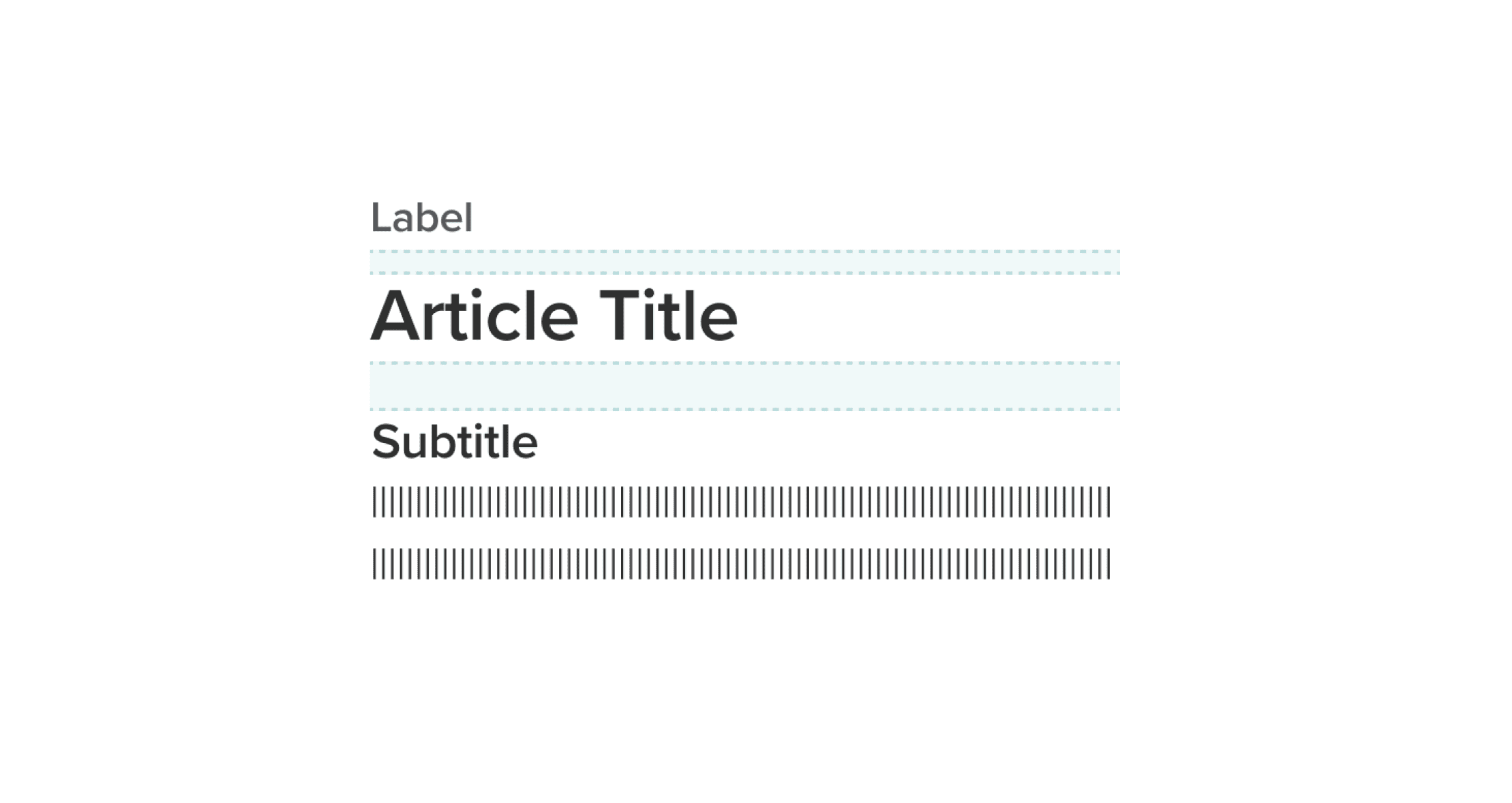
Do
Use spacing to reinforce hierarchy and importance
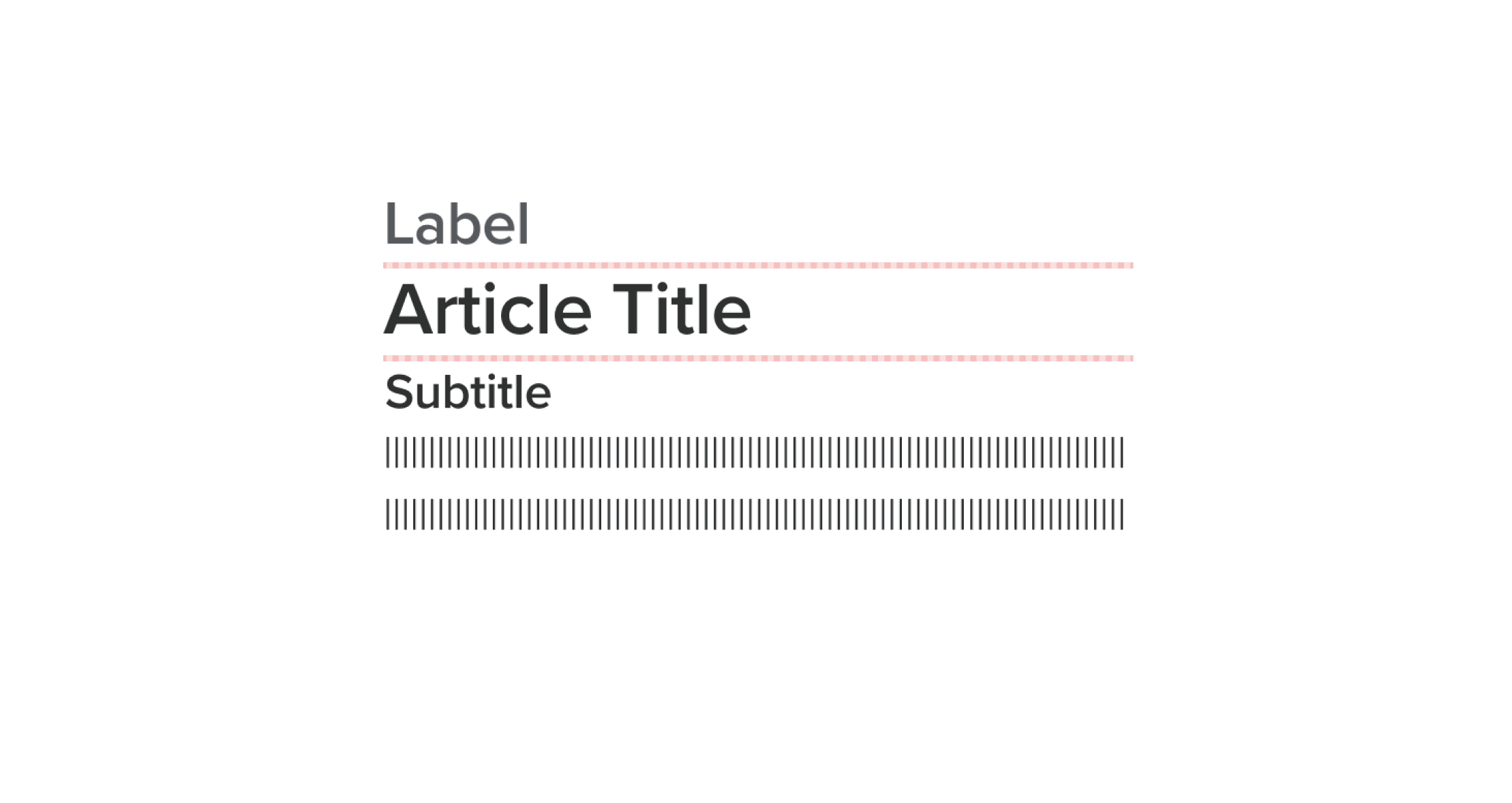
Don't
Uniform spacing makes it harder for users to understand what’s most important
White space
White space can be utilized to separate sections on a page, allowing for better organization and visual clarity. Additionally, white space helps to create focus on specific elements, directing the user’s attention and enhancing comprehension. By providing breathing room, white space aids in information processing, preventing overload and confusion. While certain sections of a UI may be dense with content, it is important to balance it with appropriate white space throughout the page, ensuring a harmonious and comfortable user experience.

Do
Use white space for clarity and focus

Don't
Avoid crowding elements too closely, which may overwhelm users
Was this page helpful?
Space
Margin
Padding
Gap